title: Using Elements summary: "Learn how to install and use Polymer Elements in your own projects." tags: ['beginner'] elements: ['paper-checkbox']
updated: 2015-05-03
Introduction
The Polymer element sets provide elements that you can use in your web pages and apps. These elements are built with the Polymer library.
You don't need to use Polymer directly to use these elements. However, using Polymer you can take advantage of special features such as data binding.
Installing Elements
You can install elements one at a time, or install a whole collection of elements.
Polymer contains a few primary collections of elements:
Iron elements. A set of utility elements including generic UI elements (such as icons, input and layout components), as well as non-UI elements providing features like AJAX, signaling and storage.
Paper elements. A set of UI elements that implement the material design system.
Gold elements. Form elements for ecommerce.
Neon elements. Animation-related elements.
Platinum elements. Elements for app-like features, like push notifications, offline caching and bluetooth.
If you find a component you want while browsing the docs, simply click the star to add it to your collection.
When you've selected some components, you can download either a bower.json file or a ZIP file.
bower.jsonfile. Just the metadata you need to install the components using Bower.Bower is the recommended way to manage components. Bower also handles installing the components' dependencies and updating installed components. For more information, see Installing with Bower.
ZIP file. A single file containing your selected components and all their dependencies, so you can unzip and start using them immediately. The ZIP file requires no extra tools, but doesn't provide a built-in method for updating dependencies. For more information, see Installing from ZIP files.
To download the components in your collection:
Click and select the Download tab.
Choose a download format and click Download.
Pick your method and follow the instructions in the download dialog.
If you install one or more elements, you also get the Polymer library, as well as the web components polyfills, which allow you to run Polymer on browsers that don't yet support the web components standards.
Installing with Bower
The recommended way to install Polymer elements is through Bower. To install Bower, see the Bower web site.
Bower removes the hassle of dependency management when developing or consuming elements. When you install a component, Bower makes sure any dependencies are installed as well.
Project setup
If you haven't created a bower.json file for your application,
download the bower.json from the catalog and edit it to add your
own project name and version.
If you already have a bower.json file, merge the
dependencies section of the downloaded file into your existing
bower.json file.
The resulting file should look something like this:
{
  "name": "my-project",
  "version": "0.0.0",
  "dependencies": {
    "iron-a11y-keys": "PolymerElements/iron-a11y-keys#^1.0.0",
    "iron-ajax": "PolymerElements/iron-ajax#^1.0.0",
    "paper-button": "PolymerElements/paper-button#^1.0.0"
  }
}
The next step is to install your selected components:
bower install
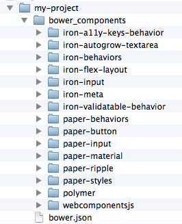
Bower adds a bower_components/ folder in the root of your project and
fills it with your selected elements and their dependencies.
Installing from the command line
You can also install components from the command line using the bower install command.
You can also choose one of the commonly-used packages:
PolymerElements/iron-elementsPolymerElements/paper-elementsPolymerElements/gold-elements
For example:
bower install --save PolymerElements/iron-elements
--save adds the item as a dependency in your app's bower.json.
Updating packages
When a new version of Polymer is available, run bower update
in your app directory to update your copy:
bower update
This updates all packages in bower_components/.
Installing from a ZIP file
When you download a component or component set as a ZIP file, you get all of the dependencies bundled into a single archive. It's a great way to get started because you don't need to install any additional tools.
Expand the ZIP file in your project directory to create a bower_components folder.
Unlike Bower, the ZIP file doesn't provide a built-in method for updating dependencies. You can manually update components with a new ZIP file, or you can update the files using Bower.
Migrating from a ZIP file to Bower
If you downloaded a ZIP file and subsequently install Bower, you can
use bower init to create a new bower.json file with your existing
dependencies in it:
bower init
This generates a basic bower.json file.
Enter Y when prompted to set currently installed components as dependencies.
Some of the questions, like "What kind of modules do you expose," can be skipped by pressing Enter.
Using elements
To use elements, first load the web components polyfill library, webcomponents-lite.min.js.
Many browsers have yet toimplement the various web components APIs. Until they do, webcomponents-lite
provides polyfill support. Be sure to include
this file before any code that touches the DOM.
Once you have some elements installed and you've loaded webcomponents-lite.min.js,
using an element is simply a matter of loading the element file using an
HTML Import.
An example index.html file:
<!DOCTYPE html>
<html>
  <head>
    <!-- 1. Load webcomponents-lite.min.js for polyfill support. -->
    <script src="bower_components/webcomponentsjs/webcomponents-lite.min.js">
    </script>

    <!-- 2. Use an HTML Import to bring in some elements. -->
    <link rel="import" href="bower_components/paper-button/paper-button.html">
    <link rel="import" href="bower_components/paper-input/paper-input.html">
  </head>
  <body>
    <!-- 3. Declare the element. Configure using its attributes. -->
    <paper-input label="Your name here"></paper-input>
    <paper-button>Say Hello</paper-button>
    <div id="greeting"></div>

    <script>
      // To ensure that elements are ready on polyfilled browsers,
      // wait for WebComponentsReady.
      document.addEventListener('WebComponentsReady', function() {
        var input = document.querySelector('paper-input');
        var button = document.querySelector('paper-button');
        var greeting = document.getElementById("greeting");
        button.addEventListener('click', function() {
          greeting.textContent = 'Hello, ' + input.value;
        });
      });
    </script>
  </body>
</html>
If you aren't using the polyfill, you can't rely on the WebComponentsReady event. Instead,
simply place script at the end of the file (after any custom elements).
Polymer element APIs
To use Polymer elements effectively, it's important to be familiar with a few of the common Polymer element APIs.
Attribute and properties
The Polymer element docs list element properties, but not element attributes. Unless otherwise noted, every property on a Polymer element has a corresponding attribute. Use the attribute name when configuring a property from markup, or when creating a Polymer data binding to a property.
When mapping attribute names to property names:
Attribute names are converted to lowercase property names. For example, the attribute
firstNamemaps to the propertyfirstname.Attribute names with dashes are converted to camelCase property names by capitalizing the character following each dash, then removing the dashes. For example, the attribute
first-namemaps to the propertyfirstName.
Passing object and array values in attributes
HTML attributes are string values, but sometimes you need to pass more complicated values into a custom element, such as objects or arrays. Ultimately, it's up to the element author to decide how to decode values passed in as attributes, but many Polymer elements understand attribute values that are a JSON-serialized object or array. For example:
<roster-list persons='[{"name": "John"}, {"name": "Bob"}]'></roster-list>
For Polymer elements, you can find the expected type for each attribute listed in the API docs. If you pass the wrong type, it may be decoded incorrectly.
The same mappings happen in reverse when converting property names to attribute
names (for example, if a property is defined using reflectToAttribute: true.)
Data binding
Polymer elements also support data binding, using a format like this:
<my-element property-name="{{hostProperty}}"></my-element>
These data binding annotations are only supported in two places:
In the local DOM template of a Polymer element.
Inside an autobinding template.
For more information see Data binding.
DOM manipulation
Because not all browsers support shadow DOM natively, Polymer uses a shim called shady DOM to achieve shadow DOM's goals of composition and style encapsulation.
As a result, if you are manipulating a Polymer element, you need to use the Polymer.dom
APIs to maintain the correct DOM structure. This is particularly important when adding or removing
children from a Polymer element, for example.
For more information, see DOM API.
Custom CSS properties and mixins
Many of the Polymer elements can be styled using custom CSS properties and mixins.
Property and mixin values can be specified:
- Inside a Polymer element's
<style>tag to specify values scoped to that element. - Inside a
custom-styleelement to specify values in the document scope.
For more information, see Cross-scope styling and Custom element for document styling (custom-style).